Tuesday, May 9, 2017

Regression Analysis

Introduction


  There are two parts to this assignment. Part one will consist of using Excel and SPSS to conduct regression analysis to see if crime rates (per 100,000 people) are dependent on free school lunches within the same area. A previous study had recently claimed that the free student lunch rate increases the crime rate. This will either be verified or debunked using the SPSS and Excel regression tools. Then, using the regression equation, an estimate will be made for the crime rate of a town if it has a 23.5% free lunch rate. Part two entails using single linear regression, multiple linear regression, and residual analysis to help out the city of Portland see what demographic variables influence 911 calls, and to help out a private construction company by determining an approximate location of where to build a new hospital,

Part 1: Crime and Free Student Lunches

Run the Regression in SPSS
  First, it was decided that the percent of free student lunch is the independent variable and that the crime rate is the dependent variable. This is the case because the question at hand is if the free lunch rate influences the crime rate. Not that if the crime rate influences the free student lunch rate.
  Then, the regression analysis was ran by navigating to Analyze → Regression → Linear where the free lunch rate was set as the independent variable and the crime rate was set as the dependent variable. This created a couple of nice tables which help explain the relationship between the variables. The first table generated was the Model Summary which is displayed below in figure 6.0. This gives the R value, the r² value, the adjusted r² value, and the standard error of the estimate. The r² value of .173 indicates that there is a very weak relationship between the two variables. The standard error of the estimate looks fairly low at 96.1, but this value doesn't mean anything at the moment. It needs to be compared to other standard error of the estimate values with the same variables but with different values for it to carry meaning.

Model Summary for Free Lunch Rate and Crime Rate
Fig 6.0: Model Summary for Free Lunch Rate and Crime Rate
  Also generated from the SPSS regression analysis was a Coefficients table. This can be seen below in figure 6.1. This important information in this table is the constant / slope (B), the test statistic (t), and the significance value (Sig.) of the PerFreeLunch. The Constant value of 21.819 represents the presumed crime rate if the free student lunch rate is 0. The PerFreeLunch value of 1.685 is the amount in which the crime rate increases per 100,000 people every time there is a 1 percent increase in the free student lunch rate. The most important value in this table is the significance value shown in the PerFreeLunch row. Because this value is .005, this means that there is relationship between crime rate and free student lunch rate which is significant at the 95% level. This also means that the result of the hypothesis test ran by SPSS is that the null hypothesis is rejected. Even though the r² value is very low and indicates a very weak relationship between the two variables, the significance value of .005 indicates that there is statistical relationship between them.

Coefficients Table
Fig 6.1: Coefficients Table
  Using this information provided in the charts, a regression equation was assembled using the y = ax + b format. The equation is Crime Rate Per 100,000 People = 1.685 * Percent Free Student Lunch + 21.819. In the y = ax + b equation, the y represents the dependent variable, the a represents the slope, x represents the independent variable, and b represents the constant.
  With this equation, an estimation of crime rate can be calculated with a given free student lunch value. If a town has a free student lunch rate of 23.5%, its estimated crime rate using the regression equation is 61.417 (per 100,000 people). 
  Using Excel, a scatter plot was created to show the crime rates and free student lunch rates. This can be seen below in figure 6.2. The r² value and the equation of the linear regression line is displayed on the chart as well. The one outlier value which is a crime rate of 704 has significant influence on the regression line. However, outliers do happen, and it would foolish to not include it. 
Crime and Free Student Lunch Rate
Fig 6.2: Crime and Free Student Lunch Rate
  Based off of all this information, the study which claimed that the free student lunch rate influences the crime rate can be verified. Using the r² value, 17.3% of the increase in the crime rate can be attributed to the free student lunch rate. The significance level of .005 also indicates that there is a relationship and a correlation between the two. Although this relationship is significant, the free lunch rate doesn't explain very much of the crime rate. Because the significance level is very significant, there is a good amount of confidence in these results. 

Part 2: Portland 911 Calls and Future Hospital Location

Introduction

  The hypothetical scenario for Part two is that the city of Portland Oregon is concerned about the response time of 911 calls. They want to know what demographic variables may help predict the number of 911 calls. Also, a private company is interested in building a hospital, but they need some help in knowing where to build it. Using single regression, multiple regression, and residual analysis an approximate location for the new hospital will be found.

Methods

Step 1: Run Single Regression in SPSS
  The independent variables Jobs, LowEduc, and FornBorn were chosen to run single regression analysis against the dependent variable Calls. Jobs represents the number of jobs in the census tract, LowEduc is the number of people without a high school diploma, FornBorn is the number of foreign born residents, and Calls is the number of 911 calls. The output of this analysis will show how well the independent variable is able is to predict and explain the number of 911 calls.

Step 2: Run Multiple Regression in SPSS and Apply the Kitchen Sink Approach
  Then, using the independent variables Jobs, Renters, LowEduc, AlcoholX, Unemployed, FornBorn, Med Income, and CollGrads, a multiple regression analysis was ran using calls as the dependent variable. Med Income is household median income, and CollGrads is the number of college graduates. The option to include collinearity diagnostics was checked before running the analysis. This can be found by navigating to Analyze → Regression → Linear → Statistics.
  The kitchen sink approach is used to help see which independent variables are driving the linear regression equation the most. To start, one looks at the significance and Beta values of the independent variables found in the output of the analysis. One then throws out one variable at time based on the significance and Beta values. Generally, the variable which has the lowest Beta value which isn't significant is thrown out. The multiple regression is run again with all of the variables except the one tossed out. Again, another independent variable is chosen to be tossed based on the Beta and significance levels. This process continues until all of the variables ran in the multiple regression analysis are significant. There were three independent variables which were found to driving the regression equation the most using this method: Jobs, LowEduc, and Renters.

Step 3: Use the Stepwise Apprach with Multiple Regression
  The stepwise approach is similar to the kitchen sink approach in that it finds the variables which drive the linear regression equation the most, but instead of manually weeding out the variables like in the kitchen sink approach, the computer automatically chooses the variables it thinks drive the equation the most. The stepwise approach is simple. It shows the user the variables which area included and excluded and all of the stats for both of them. It is a much easier method to use than the kitchen sink approach. Running the multiple regression analysis using the stepwise method, the computer chose Renters, LowEduc, and Jobs as the three variables which drive the linear regression equation the most.

Step 4: Find the Residuals of the Included Stepwise Varibales and Most Important Single Regression Variable
  The residuals of the stepwise output were of three variables Renters, LowEduc, and Jobs together. They were calculated by running the stepwise multiple regression analysis again. This time though, the box to have standardized residuals calculated had to be checked before running the regression. This can be found by navigating to Analyze → Regression → Linear → Save and then checking the Standardized check box in the Residuals section. This created a new field containing the residuals for for each census tract. The field was renamed as ResidualsStep. Then, a new Excel workbook was created to help standardize the data so that only the UniqID and ResidualsStep fields where in the document.
  The most important single linear regression variable of LowEduc, Jobs, and ForgnBorn was LowEduc. This was determined because of these three variables, LowEduc had the highest significant r² value. The residuals were then calculated using the same methods as with the stepwise variables. This residual field was renamed as LowEduResid and was copied and inserted in the same Excel spreadsheet used for the stepwise residuals.

Create Maps
  Lastly, 4 maps were created. The first map was of just the number of 911 calls by census tract. The second map was of the residuals of the LowEduc variabe. The third map was of the residuals of the three included variables in the stepwise output. Lastly, the fourth map was created to show the prime census tracts for which the hospital should be built in


Results / Discussion

Single Variable Regression

Foreign Born
  Below in figure 6.0 is the Model Summary of the linear regression output of having calls as the dependent variable and ForgnBorn as the independent variable. It shows that the r² value is .552 which indicates that there is a fairly strong relationship between foreign born individuals and the number of 911 calls. It also means that the number of foreign born citizens in a census tract can help expain 55.2% of the variation in the number of 911 calls.

ForgBorn Regression Output
Fig 6.0: ForgnBorn Regression Output
  Figure 6.1 shows the Coefficients output. This contains important information about the significance level and the constant value in the linear regression equation y = ax + b. The significance value of .000 means that result of the hypothesis test ran by SPSS is that the null hypothesis rejected, and that there is a relationship between the number of 911 calls and the number of foreign born citizens. The B values can be use to create the linear regression equation. It is The Number of 911 Calls = .08* The Number of Foreign Born Persons + 3.043. The .08 means that for every time there is one more foreign born citizen in a census tract, the number of 911 calls in that census tract will increase by .08 calls.
ForgnBorn Coefficents
Fig 6.1: ForgnBorn Coefficents
Jobs
  The Model Summary for the linear regression output between the number of jobs and the number of 911 calls is shown below in figure 6.2. The r² value for this relationship is only .340 which means that there is a moderate correlation between the two variables and that 34.0% of the variation in the increase of  the number of 911 calls is because of the number of jobs.
Jobs Model Summary
Fig 6.2: Jobs Model Summary

  The Coefficients part of the output for this regression is shown below in figure 6.3. The significance value of .000 means that the null hypothesis is rejected and that there is a relationship between the number of jobs and the number of 911 calls. The B value of .007 means that there is a positive relationship between the two as well. The linear regression equation for this output is The Number of 911 Calls = .077 * The Number of Jobs + 18.640. This equation tells the reader two things. The first is that each time there is an added job in the census tract, the number of 911 calls increases by .077 calls. The second thing if there were no jobs in the census tract, theoretically there would be 18.640 911 calls.
Jobs Coefficients
Fig 6.3: Jobs Coefficients
Low Education
  The last variable used to run linear regression against the number of 911 calls was the number of people without a high school degree (LowEduc). The Model Summary for this analysis is shown below in figure 6.4. The r² value of .567 indicates that there is a strong relationship between Calls and LowEduc and that 56.7% of the increase in the number of calls can be attributed to the number of people without a high school degree.
LowEduc Model Summary
Fig 6.4: LowEduc Model Summary
The Coefficients section of the output is shown below in figure 6.5. The significance value of .000 means that there is a relationship between LowEduc and Calls, and that the null hypothesis is rejected. Using the B values, the linear regression equation can be put together. It is The Number of 911 Calls = .166 * The Number of People Without a High School Degree + 3.931. This equation tells the reader that for each time there is added person without a high school degree in the census tract, the number of 911 calls increases by .166 calls, and that if there were no persons in the census tract without a high school degree, then there would be 3.931 911 calls.
LowEduc Coefficients
Fig 6.5: LowEduc Coefficients
  Although these three outputs demonstrates that there are relationships between the number of 911 calls and the number of foreign born citizens, the number of jobs, and the number of people without a high school degree individually, it doesn't help out the hypothetical company in determining where to put the new hospital by itself.

Multiple Variable Regression

  Figure 6.6 shows the Model Summary of the multiple regression output executed in step 2 of the methods section. The r² value of .783 means that there is a very strong correlation between all of the input variables (number of college graduates, number of people without a high school degree, number of jobs, household income, number of unemployed persons, number of renters, number of foreign born persons, and the number of alcohol sales) and that 78.3% of the variation in the number of 911 calls is because of these variables. It is important to note that the r² value is based on all the variables put together. It doesn't tell the reader anything about any particular independent variable.
Fig 6.6: Multiple Regression Model Summary
  Next, the Coefficients table for the multiple regression output is shown below in figure 6.7. This shows which variables have a significant relationship with the number of 911 calls. These significant variables include Jobs and LowEduc. With all the variables together, all the other variables besides these two are not pegged as significant by SPSS. This means that for all the variables except Jobs and  LowEduc, the null hypothesis is failed to be rejected meaning that statistically there is no relationship between those variables and the number of 911 calls. However, a linear regression equation can still be generated using the B column. The Equation is The Number of 911 Calls = The Number of Jobs * .005 + The Number of Renters * .019 + The Number of  Persons Without a High School Degree * .136 + The Number of Alcohol Sales * -.00001597 + The Number of Unemployed Person * -.01 + The Number of Foreign Born Persons * -.014 + The Average Household Median Income * -.00007827 + The Number of College Graduates * .030 + 2.526. The variables Jobs, Renters, Low Educ, and CollGrads have a positive relationship with the number of 911 calls, and the variables AlcoholX, Unemployed, ForgnBorn, and MedIncome have a negative relationship with the number of 911 calls.
Fig 6.7: Multiple Regression Coefficients
  Some collinearity diagnostics statistics were also generated while running the multiple variable regression. This can be seen below in figure 6.8. This table can be used to see if multicollinearity is present. Multicollinearity is when the independent variables correlate too much with each other, thus causing there to be issues with the multiple regression correlation. To check for this, one first looks at the Eigen value in the last dimension of the chart. The closer this value is to 0, the more likely multicollinearity present. The Eigen value in this regression is .014 which is fairly close to 0. If Eigen value is not close to 0, then it is likely that multicollinearity isn't present. If it looks like it may be present, then one looks at the condition index. If the condition index is above 30, then multicollinearity is present. If it's below 30, then no multicollinearity is present. The condition index for this regression output is 21.769, which indicates that the is no multicollinearity between the independent variables. If this index value were to be greater than 30, then one would have to look at the variance proportions of the variables. The independent variable which has a variance proportion value closest to 1 would be thrown out and then a new multiple regression output would be created with out it in an attempt to eliminate multicollinearity.
Collinearity Statistics for the Multiple Regression Output
Fig 6.8: Collinearity Statistics for the Multiple Regression Output
  The multiple regression output doesn't do much in the way of helping out the hypothetical company place the hospital either by its self. It does help to see how well certain variable relate with the number of 911 calls though.

Kitchen Sink Output 
  Below in figures 6.9 and 6.10 are the Model Summary and the Coefficients output of the kitchen sink method executed in step 3 of the methods section. The r² value is .771 which indicates that there is a strong relationship between Jobs, LowEduc, and Renters. This is because the weaker variables were weeded out in the process of getting to this point.

Fig 6.9: Kitchen Sink Model Summary
  The significance levels for each variable is less that .05 meaning that there is a relationship between them and the number of 911 calls. The regression equation from this output is The Number of 911 Calls = Jobs * .004 + LowEduc * .103 + Renters * .024 + .789. Because LowEduc has the highest beta value, it can be assumed that this drives the equation the most.
Fig 6.10: Kitchen Sink Coefficients
Stepwise Output
  The same three variables were selected from executing the stepwise output. This can be seen below in figure 6.11 in the Model Summary. The computer liked the variables Renters, LowEduc, and Jobs. The .711 r² value for these variables are found in the bottom row of the chart. The first two r² values are not of all three variables put together. The first one is just of Renters, and the second one is of Renters and LowEduc. The last row is of all the variables together. This r² value shows that there is a strong relationship between the independent variables and the number of 911 calls. Not surprisingly, the same variables that were selected to be important using the kitchen sink approach were also selected by the computer in the stepwise output approach.
Stepwise Model Summary
Fig 6.11: Stepwise Model Summary
  Next, figure 6.12 shows which variables were not included in the stepwise output. These can be found in the bottom third of the chart. These variables are AlcoholX, Unemployed, ForgnBorn, MedIncome, and CollGrads. The three sections of the table show the computers thought process. The computer picked one variable it though was important each time. Then compared the rest of the variables to each other again and then picked out another variable it thought was important. This process was done one more time until all the the variables it thought were important were selected.
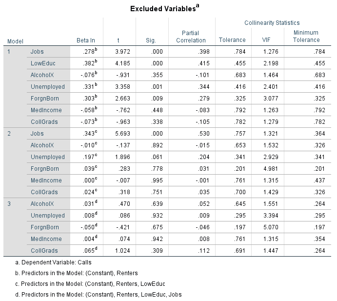
Fig 6.12: Excluded Variables
  The Coefficients table for the stepwise output is displayed below in figure 6.13. Again, the most important part of this table is found in section 3 where all three variables are placed together. Notice that all of the significance levels are under .05. This means that the null hypothesis is rejected and that there is a relationship between the independent variables Renters, LowEduc, and Jobs with the number of 911 calls. Using the B values, the regression equation The Number of 911 Calls = Renters * .024 + LowEduc  * .103 + Jobs * .004 + .789 can be assembled. Because LowEduc has the highest beta value, it drives the equation the most.

 Stepwise Coefficients
Fig 6.13: Stepwise Coefficients

Maps
  
  This first map shown below in figure 6.15 shows the number of 911 per census tract. The number of 911 calls don't need to be standardized to population because each census tract approximately  populates the same number of people. There is a good amount of clustering in the number of 911 calls. There are five counties located in the northern part of the census tracts in the map which have between 57 and 176 911 calls. They are located near the suburb of Beaverton which can be seen somewhat through the map.
Number of 911 Calls Map
Fig 6.15: Number of 911 Calls Map 
  This is the main map which should be used to help out the construction company choose a location for the new hospital. It should probably be located between those 5 neighboring census tracts which have the highest classification of 911 calls.
  This next map shown below in figure 6.16 shows the standard deviations of the residuals for the LowEduc variable. This map shows how well the equation 911 Calls = .166 * The Number of People Without a High School Degree + 3.931 predicts the number of 911 calls. The darker the red or blue, the worse the equation did at predicting the number of 911 calls. The more yellow the census tract is, the better the job the equation did at predicting the number of 911 calls for that census tract. Census tracts in red are where there is a higher standard deviation of the residuals. This means that the 911 calls regression equation under predicted the number of 911 calls in these areas. The census tracts in blue are where there are lower standard deviation of the residuals. This means that the 911 calls regression equation over predicted the number of 911 calls in these areas.
  Some of the census tracts which are red overlap the areas where there are a higher number of 911 calls. There are two census tracts which stand out. They are the ones which have very high residuals from the regression equation. These two counties overlap with the two of the counties which have at least 57 911 calls from the cloropleth map above in figure 6.15.
Low Education Residual Map
Fig 6.16: Low Education Residual Map
  This next map displayed below in figure 6.17 shows the residuals by census tract of the variables Renters, LowEduc, and Jobs. The same analysis can be applied here. The red census tracts are where the equation / model The Number of 911 Calls = Renters * .024 + LowEduc  * .103 + Jobs * .004 + .789 under predicted the number of 911 calls. The blue census tracts represent the tracts which the model over predicts the number of 911 calls.
Renters, Low Education and Jobs Residual Map
Fig: 6.16: Renters, Low Education and Jobs Residual Map

  Using the three maps above and combining it with its corresponding SPSS output, a few potential census tracts for where the new hospital should be built can be identified. Because the independent variables Renters, Low Education, and Jobs and Low Education by itself all have a significant relationship with the number of 911 calls the hospital would be best suited to be built near the areas where the linear regression model underestimates the number of 911 calls (The areas in red in the residual maps). The hospital should also be built in or near the 5 main census tracts identified in figure 6.15. With this, another map was created to show census tracts best suited for the new hospital's location. This can be seen below in 6.17. This census tract was chosen based on the data displayed in the three maps above.
Best Census Tracts For a Hospital
Fig 6.17: Best Census Tracts For a Hospital
  As far as for the city of Portland, These independent variables Renters, Low Education, and Jobs do the best at explaining where 911 calls come from.

Conclusion

  In conclusion, the prime census tracts for a new hospital were found by using US census demographic data and by analyzing it using SPSS and ArcGIS software. This proves that demographic data can be used to help solve real world issues. Thinking about other applications which could use this type of analysis, although the data in this assignment only looked at placing a new hospital, GIS firms or local governments could use identify areas of where to place a new school, gas station, store, assisted living center, and many other things.
  Although not all of the SPSS output data was used in the maps, It is possible that one could use many more combinations of independent variables to achieve any desired output. It it good practice to start by looking at some variables, just like in this assignment, and then see which variables explain the dependent variables the best. Both the kitchen sink and stepwise approach were used in this lab. However, the kitchen sink approach was used to gain a better understanding of how filtering independent variables works. In future similar analysis, a stepwise regression output would suffice.

Monday, April 24, 2017

Correlation and Spatial Autocorrelation

Introduction

  There are two parts to this assignment. The first part will consist of using IBM SPSS Statistics Viewer to calculate correlation statistics and significance levels for Milwaukee census tract demographic data and then describing the results and the second part will consist of using spatial autocorrelation with Texas Election Commission (TEC) data for the 1980 and 2016 elections. The patterns found in the TEC data will also be described and analyzed. A series maps will be created to help promote discussion.


Using IBM SPSS to Explain Milwaukee Demographics

  Figure 5.1 shows the correlation matrix with all of the demographic information from the Milwaukee Excel sheet. Correlation is described based on strength and direction. The strength of a correlation is either positive, negative, or null. A positive correlation means that as one variable increases, the other does as well. A negative correlation means that as one variable increases, the other decreases. A null correlation means that there is no statistical correlation between the two variables. The significance level tells the user how significant the correlation is. If the significance value is less than .05, then the correlation r value is significant at the 95% level. This implies that the chance for a false positive is less than 1 in 20.
Fig 5.0: Demographic Correlation Chart
  This chart provides the Pearson Correlation (r values), the significance level (95% confidence level, two tailed), and the number of samples for each correlation. In the Pearson correlation, the number of stars refers to the level which the correlation value is significant to. One star means that the value is significant to the .05 level and two stars mean that the value is significant to the .01 level. The significance level also indicates the results of a hypothesis test performed by the SPSS software. If the significance value is less than or equal to .05, the null hypothesis is rejected which means that there is a statistical correlation between the two variables. If the significance value is greater than .05, then the result is that one fails to reject the null hypothesis meaning that there is no statistical correlation between the two variables.
  Based off of the chart, the number of manufacturing employees (Manu) has moderate positive correlation with the number of retail employees (Retail), a moderate positive correlation with the number of finance employees (Finance), a strong positive correlation with the White population (White), a weak negative correlation with the the Black population (Black), a weak positive correlation with the Hispanic population (Hispanic), and a weak positive correlation with median household income (Medinc).
  The number of retail employees has a moderate positive correlation with the number of finance employees, a strong positive correlation with the White population, a very weak negative correlation with the Black population, a null correlation with the Hispanic population, and a very weak positive correlation with median household income.
  The number of finance employees has a strong positive correlation with the White population, a very weak negative correlation with the Black population, a very weak negative correlation with the Hispanic population, and a moderate positive correlation with median household income.
  The White population has a moderate negative correlation with the Black population, a very weak positive to null correlation with the Hispanic population, and a moderate positive correlation with median household income. The Black population has a very weak negative correlation with the Hispanic population and has a weak correlation with median household income. Lastly, the Hispanic population has a null relationship with median household income.
  Although its nice to know the strength and direction of correlation between two variables, choosing stand out trends to analyze is more beneficial and informational. For example, the Black population has a negative correlation with everything. Also, all of the Black population correlation values are significant to the .01 level. This means that where there is a larger Black population, there is lower median household income, less retail employees, less manufacturing employees, less finance employees, and less people of White and Hispanic races. Another stand out trend is that the White population has a positive correlation with everything except the Black population. All of the White population correlation values are at least significant to the .05 level. This means that where there is a larger White population there is a larger Hispanic population, greater median household income, greater number of manufacturing employees, increased number of retail employees, and an increased number of finance employees. Looking at the Hispanic population correlations, there is a mix between positive and negative correlation across all demographic categories.

Spatial Autocorrelation

Introduction
  The  hypothetical scenario for this question is that the author has been given access to election data from the Texas Election Commission (TEC) from 1980 and 2016. The TEC want to know the trends of the percentage of the democratic vote, the overall percentage of voter turnout, and the percent Hispanic voters. The TEC want to know how these variables have changed over the past 36 years. To analyze these trends, both GeoDa and SPSS software will be used to see if there is any clustering with the variables, or any correlation between them.

Methods
  The Texas election data was given as part of this assignment. However, the percent Hispanic population by county estimates had to be downloaded from the Census Fact Finder's website. The Texas county shapefiles also had to downloaded from this site. Then, the demographic data was standardized in the Excel sheets. The Texas election data, and the Hispanic population data was then joined to the Texas shapefile. The joined output was then saved as a shapefile because the GeoDa software doesn't recognize feature classes, just shapefiles. The Excel tables were then edited to only standardized even further to display only the necessary demographic data so that it would be easy to use when creating a correlation matrix with the SPSS software.
  Next, the GeoDa software was used to create 5 maps and 5 Moran's I scatter plots. The variables used in these maps and charts include the perent of voter turnout for 1980 by county, the  percent of voter turnout for 2016 by county, the percent democrat vote for 1980 by county, the percent Democrat vote for 2016 by county, and the percent Hispanic population for 2015 by county.
  To create the maps and charts, first a new project was created using the saved shapefile which contained all of the demographic information. Then, because spatial autocorrelation requires a spatial weight, the county shared boundaries were used for this. This is done by going to Tools → Weights Manager → Create. Then, the Add ID Variable button was clicked on and the Poly_ID was used which is the shared county boundary. The Rook contiguity was used. Then, the Cluster Maps Univariate Local Moran's I  was clicked on. Then, the demographic statistic which was going to mapped was chosen and the option to construct a scatter plot, and cluster map was chosen. This was done with all 5 demographic statistics.
  Lastly, SPSS was used to create a correlation matrix using the super standardized Excel spreadsheet.

Results / Discussion
  The way spatial autocorrelation works for this scenario is each county is either classified as high high, high low, low high, low low, or not classified. High high means that the county has a high value for the input variable and is surrounded by other counties that have high values. High low means that the county has a high value of the input variable, but is surrounded by counties with low values. Low high means that the county has low values of the input variable, but is surrounded by counties with high values. Low low means that the county has low values of the input variable and is surrounded by counties with other low values. Because the world, demographic information, and election data isn't random, there is clustering. Generally, it is more common so see more high high's and more low low's than it is to see low high's and high low's.
  Moran's I value is a value used to compare the value of a specific variable from one area (county), in this case it's the demographic or election statistic, with the value of other surrounding areas (neighboring counties). The Moran's I value ranges from -1 to 1 just like the correlation r value. However, they carry different meanings, The closer the Moran's I is to -1, the less clustered the data is. The closer the Moran's I is to 1, the more clustered the data is. The Moran's I doesn't indicate the direction of anything, it just indicates how clustered things are within a specified study area.
  This first map and Moran's I chart was created using Geoda to show the percent Democrate vote for 1980. The map is shown in figure 5.1, and the chart is shown in figure 5.2.
Percent Democrate Vote Spatial Autocorrelation Map
Fig 5.1: Percent Democrate Vote 1980 Spatial Autocorrelation Map

  This map shows that there is clustering of both high high's and low low's. The high high's are located mostly in the southern and eastern portion of the state. The low low's are mostly located in the northwestern part of the state and to the northwest of San Antonio. There are only two high low's and two low high's. The high high's indicate that there is a clustering of greater percent Democrat votes and the low low's indicate that there is a clustering of lesser Democrat votes.


Moran's I Chart for Percent Democrat Vote
Fig 5.2: Moran's I Chart for Percent Democrat Vote 1980
   The Moran's I chart shown above in figure 5.2 indicates that overall, the voting trend are clustered by county. A value of .575 means that there is a moderate clustering rate. It is important to remember that this Moran's I value doesn't specify the direction of the voting turnout (less or more), but it just gives the overall clustering of the data.
  This second map and chart are based on the percent Democrat vote in the 2016 election. The map is displayed in figure 5.3 and the Moran's I chart is displayed in figure 5.4.

Fig 5.3: Percent Democrat Vote 2016 Spatial Autocorrelation Map

  To no surprise, the results shown in this map are similar to that shown in the 1980 map. However, there are a few differences. First, the area of lower percent democratic vote located in the north west part of the state in 1980 have moved about 100 to 200 miles to the east. The areas of greater voter turnout have become more concentrated along the Texas - Mexico border.
 The Moran's I chart below indicates that there is a stronger moderate clustering rate between counties of higher turnout and counties of lower turnout.
Moran's I Chart for Percent Democrat Vote 2016
Fig 5.4:  Moran's I Chart for Percent Democrat Vote 2016
  This next map shown in figure 5.5 displays the the spatial autocorrelation of percent of voter turnout by county for 1980. Clustering in this map isn't as strong as in the percent Democrat vote maps. There are two main areas of both higher voter turnout and lower voter turnout. One of the areas of higher voter turnout is located in the extreme northern portion of the state and the other is located just north of San Antonio. The first area of lower voter turnout is located in the southern region of Texas and the second area is located in the very eastern part of the state.
Voter Turnout 1980 Spatial Autocorrelation
Fig 5.5: Voter Turnout 1980 Spatial Autocorrelation Map
The Moran's I chart shown in figure 5.6, indicates that the clustering is weaker than the percent Democrat votes, but that clustering is still present.
Fig 5.6: Voter Turnout 1980 Moran's I Chart
  This next map, shown below in figure 5.7 shows the percent voter turnout for 2016. The trend between the 1980 map to the 2016 map is that there is less clustering in 2016. This means that the voter turnout seems to be less influenced by location in 2016 than it did in 1980. the clustering is still similar to the 1980 map, but the clustering is less defined and a little more fragmented. It is interesting to note that the difference between the counties classified as high high and low low increased by 8 counties. This means that the clustering of lower voting turnout counties has increased relative to the number of higher voting turnout counties.
Voter Turnout 2016 Spatial Autocorrelation Map
Fig 5.7: Voter Turnout 2016 Spatial Autocorrelation Map

  Figure 5.8 shows the Moran's I chart. The Moran's I value decreased dramatically from .468 in 1980 to .287 in 2016. This means that there is less clustering of both higher and lower percent voter turnout in 2016 than there was in 1980. The Moran's I value of .287 indicates that there is a weak to very weak clustering rate among the percent of 2016 voter turnout in Texas counties.
Moran's I Voter Turnout 2016
Fig 5.8: Moran's I Voter Turnout 2016
  This next map, featured in figure 5.9, shows the spatial autocorrelatoin of the percent Hispanic population by county from 2015. The Hispanic percentage population by county is very clustered. The counties of higher percent Hispanic population are located almost exclusively along the Texas - Mexico border, and the counties which have a lesser percentage of Hispanic population are located in the eastern and north eastern portion of the state.
 Percentage of Hispanic Population by County Cluster Map 2015
Fig 5.9: Percentage of Hispanic Population by County Cluster Map 2015
  The Moran's I chart for the percentage Hispanic population by county in 2015 is displayed below in figure 5.10. The Moran's I value of .779 indicates that there is a strong clustering rate among the percentage of Hispanics by county. This is very evident in the map in figure 5.9.
Fig 5.10:  Moran's I Percentage of Hispanic Population 2015
Fig 5.10:  Moran's I Percentage of Hispanic Population 2015

  Next, the super standardized Excel table was used to create a correlation matrix in SPSS to see how the five variables relate with each other. This matrix is shown below in figure 5.11. This was created so comparisons between the percent Hispanic population statistics and the map can be more easily.


Texas Election Data and Hispanic Percent Population Correlation Matrix
Fig 5.11: Texas Election Data and Hispanic Percent Population Correlation Matrix
 The percent Hispanic has no correlation with the democratic vote in 1980. The reasons for this is because the percent Hispanic population estimates are of 2015 and the percent democratic vote of the 1980 election is from 1980. These two variables should logically have no correlation with each other which is the case.
  The percent Hispanic population has a strong positive correlation which is significant to the .01 level with the percent democratic vote for 2016. This means that there is strong overlap between the percent of the Hispanic population by county and the percent of the democratic vote. This indicates that Hispanics generally vote democrat because the relationship is strong and positive. It also would theoretically mean that the greater the percent of Hispanics there are in a county, the more likely that the county will have a larger percent democratic vote. This overlap and correlation can be seen by looking at and seeing the similarities between the two maps (Figure 5.9, and Figure 5.3). The positive overlap occurs mostly in the southern portion of the state along the Mexico - Texas border while the negative overlap occurs in the north and eastern portion of the state.
  The percent Hispanic population has a weak negative correlation with the voter turnout of 1980. This relationship doesn't mean anything and is merely a coincidence as the percent Hispanic population data is from 2015 and the voter turnout from 1980 is from 1980.
  There is a moderate negative correlation significant to the .01 level with the voter turnout of 2016. This implies that the counties which have a high percentage of Hispanics, they are more likely to have a lower percentage voter turnout. This analysis suggests that Hispanics generally have lower voter turnout.

Conclusion
  In conclusion, there are several trends identified in this lab which the TEC or governor could use to help with campaigning and identifying areas to focus on. If the governor is a democrat he or she should attempt to organize a large get out the vote event focusing in on the Hispanic population. The governor should do this because the results of this lab showed that Hispanics tend to vote democrat, but also tend to have a lower voter turnout.
  The results of this lab could also be used to see how the demographics of Texas and how it relates to election results is changing. Currently, Texas is a very republican state. For a potential future analysis, given that Hispanic population is increasing in Texas, if the rate could be found at which the Hispanic population is increasing, it would be possible to find the election year that the state of Texas would switch from being a republican state to a democratic state. This could be very useful information for the TEC, governor, and anyone that has an interest in politics.

Tuesday, April 4, 2017

Hypothesis Testing

Introduction

  In this assignment are four questions which relate to hypothesis testing. The goal of this assignment is to demonstrate an understanding of significance levels, Z-tests, T-Tests, critical values, and hypothesis testing. The questions in this assignment utilize real work data which will be used to connect statistics to geography.

Question 1

  This first question entails filling out a table which initially included the interval type, confidence level, and number of samples. The table was then completed by using materials from class such as T tables, and Z tables, and notes. The three fields filled out were α, Z-Test or T-test, and Z or T Value(s). This chart can be seen below in figure 4.0.
Critical Value Chart
Fig 4.0: Table showing statistical information about data.

Question 2

  This next question consisted of utilizing hypothesis testing to see if crop yields in metric tons in specific district in Kenya are statistical different than the rest of the country's crop yield. There are three types of crops that the Department of Agriculture and Live Stock Development organization is concerned about. They are ground nuts, cassava, and beans. The sample of 23 farmers was conducted from the concerned district. This crop result was based on metric tons per hectare. Ground nuts had an average of .52 with a standard deviation of .3, cassava had an average of 3.3 with a standard deviation of .75, and beans had an average of .34 with a standard deviation of .12.
  The null hypothesis for the ground nuts, cassava, and beans is that there is no difference between the sample crop yield and the country's average crop yield. The alternative hypothesis for the ground nuts, cassava, and beans is that there is a difference between the sample crop yield and the country's average crop yield. Because there were only 23 farmers used in the survey for the district, a T-Test will be used. When determining when to use a T-Test versus a Z-Test, one should look at the sample size. If the sample size is 30 or larger then a Z-Test should be used, If the sample size is less than 30, a T-Test should be used.
Z-Test and T-Test Equation
Fig 4.1: Z-Test and T-Test Equation
  Next, the specific test statistic values will be determined for each crop. The equation for a Z-Test and a T-Test are the same. The equation is shown on the right in figure 4.1. The top of the equation is the sample mean minus the population mean and the bottom part of the equation is the sample standard deviation divided by the square root of the number of samples. The significance level used is 95%, and a two tail test will be used.
  Using this equation, a critical value of -.7993 is calculated for the ground nuts, a critical value of -2.5578 is calculated for the cassava, and a critical value of 2.06155 is calculated for the beans.
  Then, these values are analyzed using the T-Table in the back of the textbook on page 369. The degrees of freedom (sample size minus one) is used to help look up the critical value for a 95% level of significance. Because at two tail test is used, the critical value will actually be pulled from the 97.5% column. The critical values for a two tailed test at a 95% level of significance is -2.074 and 2.074.
  By using the critical values at the 95% level with a two tailed test and comparing them to the test statistic values the results of the hypothesis test can be determined. For the ground nuts, the test statistic -.7993 falls between the critical value range so here I fail to reject null hypothesis meaning that statistically there is no difference between the crop yields of the sample from the district and the country's average. For cassava, the test statistic -2.5578 falls outside the the critical value range. This means that I reject the null hypothesis and that there is a statistical difference between the crop yield of the sample and of the country's average. Also, by looking at the means, it is determined that the district has a lower statistical harvest of cassava than the average county's harvest. For the beans, the test statistic 1.9983 falls between the critical value range meaning that I fail to reject the null hypothesis and that statistically there is no difference between the sample and the country's average crop yield.
  Using the probability chart in the back of the textbook, the probability of having or exceeding the specific test statistics can be looked up. For the ground nuts the probability found is .21656. For the cassava the probability found is .00856. Lastly, the probability found for the beans is .97037.

Question 3

  This question will also use hypothesis testing. This time, the scenario is that a researcher thinks that the level of a particular stream's pollutant content is higher than the allowable limit of 4.2 mg/L. Taking 17 samples in the stream, the researcher reveals an average pollutant level of 6.4 mg/L with a standard deviation of 4.4. For this question a one tailed test and a 95% significance level will be used.
  The null hypothesis is that there is no statistical difference between the the pollutant content of the stream and the allowable pollutant content. The alternative hypothesis is that there is a statistical difference between the pollutant content of the stream and the allowable pollutant content.
  Because there were only 17 samples of the stream taken, a T-Test will be used. Using the equation in figure 4.1, a test statistic of 2.062 is calculated. Then, this test statistic is compared to the critical value of 1.64 which was found using figure 4.0. Because the test statistic is greater than the critical value, I reject the null hypothesis. This means that statistically there is a difference between sample means stream's pollutant level of 6.4 and the allowable pollutant level of 4.2. This also indicates that the sample of stream's pollutant level is over the allowable limit. Looking in the back of the book, a probability value of .97347 was found.

Question 4

   For this question a hypothesis test was performed to see if there is a statistical difference between the average home value by block group in the city of Eau Claire compared to the block groups in the county of Eau Claire. The null hypothesis is that there is no difference between the average home values by block group between the city and county. The alternative hypothesis is that there is a difference between the average home values by block group between the city and county. Because there are 53 block groups within the city of Eau Claire, A Z-Test will be used to find the test statistic. The sample mean, population mean, standard deviation, and number of samples were found using the statistics feature in the attribute table window. Using the the equation from figure 4.1, a test statistic of -2.572 is calculated. because there was no defined confidence level stated in the question, a 95% confidence level was chosen. A 95% confidence level is pretty standard for census data. Also, a one tail test will be performed. The critical value determined with these parameters is -1.64. This was chosen based off of the table in figure 4.0. Because test statistic is lower than the critical value I reject the null hypothesis. This means that statistically there is a difference between the average home values at the block group level in the city of Eau Claire compared to the county. After looking at the Z-Score chart in the back of the text book, the probability of the city of Eau Claire's block groups is .0051. This means that the sample block groups in the city of Eau Claire at in the .51 percentile which is really low.
  A map was created showing average home values by block groups. This is shown below in figure 4.2. The city block groups are shown in the purple map and the county block groups are shown in the green map.
Map Comparing Average Home Values at the Block Group Level in the City and County of Eau Claire
Fig 4.3: Map Comparing Average Home Values at the Block Group Level in the City and County of Eau Claire
  The two different color schemes were chosen because there are different values in the legend and it would be misleading if only one color scheme was used. Looking at county map, it visually looks like many of the block groups have lower average home value than most of the county block groups. This can be rephrased to say that the county block groups have a higher average home value than the city block groups. Many of the block groups in the city are smaller than the ones in the rest of the county. This is why a separate map showing the city block groups was created

Thursday, March 9, 2017

Z - Scores and Probability

Introduction

   There are two main goals in this lab. One is to demonstrate an understanding of z-scores, and the other is to use the probability of an event occurring to determine a specific range of outcomes. The scenario in this lab consists of being hired by an independent research consortium to study the the geography of foreclosures in Dane County, Wisconsin. The Dane County government is concerned about the increase in the number of foreclosures in 2012 compared to 2011. Using the number of foreclosures by census tracts for both 2011 and 2012, the first task as a new employee is to analyze the spatial patterns of foreclosures between 2011 and 2012 and then create a prediction for the number of foreclosures in Dane County by census tract for 2013. This will be done by answering the following questions: What number of foreclosures will be exceeded 70% of the time in 2013? and What number of foreclosures will be exceeded only 20% of the time in 2013? Doing this will help to create a picture of what is happening spatially regarding foreclosures in Dane County.
  The end product will be a map of Dane County census tracts populated with the expected number of foreclosures and the range of percentiles associated with it for 2013. The expected 2013 values will be based on the patterns seen between 2011 and 2012. Also, a map showing the difference in the number of foreclosures by census tract between 2011 and 2012 will be created. The patterns found in these maps will then be analyzed and discussed.
  To demonstrate an understanding of z-scores. The term z-score will be defined, and two z-scores a piece will be calculated for census tracts 31, 114.01, and 122.01 using the 2011 and 2012 foreclosure data. These census tracts will also be used when discussing the data in the maps.

Methods

Z-Score Equation
Fig 3.0: Z-Score Equation
Defining and Calculating Z-Scores
  A z-score can be defined as a the number of standard deviations a specific observation is away from the mean. It can also be described as relative value in comparison to mean of a data set. A z-score is equal to a specific observation minus the mean of the data set all divided by the standard deviation of the data set. This equation is shown in figure 3.0 on the right. In the figure, Z represents the z-score, X represents the specific observation, µ represents the mean, and σ represents the standard deviation. A z-score is a very powerful statistic. It can be used to find the probability of a specific event occurring if the data distribution is relatively normal. Z-scores are not assigned a unit. Rather, it is a relative number to the mean. In this lab, one of the goals is to calculate the z-scores of the specific census tracts 31, 114,01, and 122.01 for both 2011 and 2012 foreclosures. This calculation is shown below in figure 3.1 for all six z-scores. The mean and standard deviation were calculated in Excel after exporting the attribute table for the Dane County shapefile. These values were then doubled checked in ArcMap under the symbology tab. The unit for the mean, standard deviation, and observations is the number of foreclosures.
Z-Score Calculations
Fig 3.1: Z-Score Calculations

Calculating the Difference in Foreclosures Between 2011 and 2012, and Predicting 2013
  To help with analysis of the foreclosures, a new field was created in ArcMap which contained the difference between the foreclosures from 2011 to 2012. This was done by taking the Count2012 and then subtracting the Count2011 field from it. This new field makes it easy to identify which tracts had an increase in foreclosures and which tracts had a decrease in foreclosures.
  This difference field was then used to predict the number of foreclosures by tract for 2013. Assuming the patterns from 2011 to 2012 stay the same from 2012 to 2013, the 2013 predicted value can be calculated by extrapolating the trend from 2011 to 2012. This consists of adding the Count2012 value with the difference value to get the predicted 2013 value. These  predicted values will be used when calculating the percentile probabilities and when creating the prediction map with the percentiles and predicted values.

Determining a Range of Outcomes Based on a Probability Using Z-Scores

  As noted before, z-scores can be a powerful statistic. This is because they can be used to help determine a range of outcomes given a probability. For this lab, z-scores will be used to determine which census tracts will fall within the top 70%, and top 20% when looking at the number of foreclosures by census tract in Dane county, Wisconsin.
  This is done by using the z-score equation in figure 3.0. However, instead of solving for the z-score "Z", the equation will be solved for a specific observation "X" which will be the break value when determining the percentile range. Another twist in the equation is that only the mean and standard deviation are given or have already been calculated based on the data. Luckily there is a way to look up a z-score based on the given probability. This can be done using a z-score chart shown below in figure 3.2. The probability of a exceeding a specific observation is shown in the chart with the numbers that have four decimal places. The z-score can be found by finding the probability in the chart and then looking to the corresponding value at the top row and at the far left column. 
  For example, wanting to find the z-score for a value in which the probability of exceeding is 51%, one would first look for .51 on the table. Often, the exact probability isn't given in the chart, so using the value just below is generally acceptable. In this case the closest number to .51 without going over is .5080 found in the third column in the first row. Looking at the corresponding value in the top row and the far left column, the z-score of 0.02 can be identified. However, this is not the right z-score. Because the value being sought after is on the left side of the mean, that means that this z-score has to be multiplied by -1 to find the correct z-score. This quirk has to only be done when the value being looked for is less than the mean. This can be identified by looking at the probability. If the probability is 51% or greater, then the sought after observation will fall to the left of the mean. 
  If the probability wanted is 49% or less then the compliment of the probability can be used to find the z-score. For example, to find a z-score for a value in which the probability of exceeding is 10%, one would take 1 - .1 to calculate .9. The number .9 would then be used in the chart. The closest probability to .9 without going over is .8997 which is found on the right side of the chart. Looking at the corresponding value at the top row and the far left column, a z-score of 1.28 can be determined. This is the z-score for the value which the top 10% of all values in the original data set are greater than or equal to.
Z-Score Lookup Table
Fig 3.2: Z-Score Lookup Table
  This process was used to determine the z-scores for the probabilities of exceeding or equaling the top 70% and the top 20%. The z-score for breaking point values for the top 70%  was -0.52 , and  for the top 20%  was 0.84.
  Now, all the values needed to solve for the breaking point value using the z-score equation are given. Because these probabilities will be based off of the 2013 prediction, the 2013 predicted values will be used to determine the mean and standard deviation. Using the statistics feature in ArcMap, the mean is 13.206 and the standard deviation is 13.409. The calculation for solving for the breaking point observations can be seen below in figure 3.3. Once again, the units for X, µ, and σ  is the number of foreclosures. With these X values solved for, it can now be said that the top 70% of the number of foreclosures by census tract in Dane county will be at least 7. Because there cannot be .23 foreclosures the number is rounded up. If it's rounded down the value wouldn't be in the top 70%. It can also be said that the top 20% of the number of foreclosures by census tract in Dane county will be at least 25.
Calculating Breaking Point Values
Fig 3.3: Calculating Breaking Point Values

Results/Discussion

  Tying the z-scores calculated from the three census tracts shown in figure 3.0 back to study question, it is clear that these census tracts have great variation when comparing them with each other and to the rest of the tracts. Tract 31 had 24 foreclosures in 2011 and 18 foreclosures in 2012. Both years, these values fell above the average. The z-score changed dramatically from 1.437 in 2011 to 0.575 in 2012. Tract 144.01 had 32 foreclosures in 2011 and 39 foreclosures in 2012. These values were well above the mean for both years. The z-score slightly increased from 2011 to 2012. Lastly, tract 122.01 had 6 foreclosures for both 2011 and 2012. The z-score slid ever so slightly from 2011 to 2012. Because the number of foreclosures stayed the same for tract 122.01 but the z-score went down, one can conclude that the overall number of foreclosures increased from 2011 to 2012. This is also evidenced by the change in the mean from 11.393 to 12.299. These random census tracts are also evidence that not every census tract is experiencing an increase in foreclosures.
  Using the values calculated in the difference field, a diverging color scheme map was created to show the difference in the number of foreclosures from 2011 to 2012. The green to red color scheme was chosen because generally, green is associated with good things and red is associated with bad things. The green hues show census tracts which had a decrease in the number of foreclosures and the red hues show the census tracts which experienced an increase in the number of foreclosures. The yellow hue shows which tracts experienced very little difference in the number of foreclosures. Looking at the three tracts: 31, 114.01, and 122.01, they are all placed within three different classifications. Tract 31 is in an interesting location. Though tract 31 decreased in the number of foreclosures, every census tract immediately surrounding it either had the same number of foreclosures or had an increased number of foreclosures.
  Without having any other data to compare the foreclosure numbers to, the reason for the increase in foreclosures cannot be determined. Also, this map doesn't show how many foreclosures there were in each census tract, it only shows the difference. Hence, a tract which had 100 foreclosures could be in the same category as a tract than had only 3 foreclosures. However, this map does a good job at showing that there is a large increase in the number of foreclosures. There are a total of 8 tracts which had an increase of foreclosures between 10 to 16 compared to only 3 tracts which had a decrease in foreclosures between 9 and 14. The change in these extreme tiers is a strong sign that the number of foreclosures is rising between 2011 and 2012.
Differences in Foreclosures Map
Fig 3.4: Differences in Foreclosures Map
  The map shown in figure 3.5 was created using the percentiles and values calculated by given probabilities and the extrapolation of the trends between 2011 and 2012. It shows the predicted percentiles and raw number of foreclosures expected in 2013 by census tract in Dane county using a sequential color scheme. Tract 114.01 is a part of the darkest hue of purple. This is classified as 80% - 100% (25 -57). This means that this tract (114.01) or any other tract within the same classification, will be in the upper 20% of tracts when it comes to the number of foreclosures in Dane county, and its number of foreclosures will fall somewhere between 25 and 57. Tract 31, located just west of tract 114.01, is predicted to be within the upper 70% of tracts, and is expected to have between 7 and 24 foreclosures. The overall pattern is that there will even more foreclosures in 2013 than there were in 2012. Also, that the tracts which experienced more foreclosures in 2012 than 2011 will experience twice as many foreclosures when comparing 2013 to 2011.
Predicted 2013 Percentiles and Number of Foreclosures
Fig 3.5: Predicted 2013 Percentiles and Number of Foreclosures

Conclusion

  In conclusion, unfortunately for the Dane county officials, the number of foreclosures is predicted to be on the rise in 2013. There were 97 more foreclosures in 2012 than there were in 2011. Based off this data, the pattern was extrapolated to create a prediction for 2013. This prediction calls for the census tracts which experienced an increase in the number of foreclosures to continue increasing at the same rate, and for the census tracts which experienced a decrease in the number of foreclosures to continue decreasing at the same rate.
  Based off of these findings, if the 2011 to 2012 patterns continue, this could be very bad news for Dane county. Likely, many people will be left looking for new homes, and will be forced to move out of the county in order to find cheaper housing. This could impact the local economy and job market in a negative manner.
  Also, it is most likely be advantageous to the county to reverse this trend by encouraging people to continue to live in Dane county. They could lower their county taxes, or try to create higher paying jobs within the county. This could be done through government legislation or by advocating larger companies to move to the county.

Sources

Think Calculator, Z-Score Formula
US Census Bureau